 What I already suspected, the typographers from 1920 have prepared a nice surprise. It can be seen on the picture which shows the lettering on both sides of the building. My guess is, that the sign with Gemeentelyke (Municipal) is older than the sign with afd zuigelingenzorg (Baby Care Dept.) on it. Or, the second sign had to be put up in a hurry. Anyway, the nice E with the white stripe on only the upper part got transformed to an E with a larger white stripe on the other side of the stem. This means I'll have to do some serious experimenting.
31 december 2006
It's surprise #1
What I already suspected, the typographers from 1920 have prepared a nice surprise. It can be seen on the picture which shows the lettering on both sides of the building. My guess is, that the sign with Gemeentelyke (Municipal) is older than the sign with afd zuigelingenzorg (Baby Care Dept.) on it. Or, the second sign had to be put up in a hurry. Anyway, the nice E with the white stripe on only the upper part got transformed to an E with a larger white stripe on the other side of the stem. This means I'll have to do some serious experimenting.
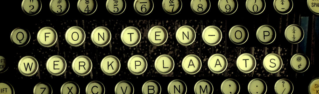
30 december 2006
Promising new Deco-font
 On the imagebank of the Municipal Archives Amsterdam I found a picture of a wooden building that was meant to give medical care to babies and toddlers. The building was run by the Health Care Department of the city. The lettering on the facade was - I guess - specially made for this building and it is striking in its simplicity.
I'm sure that trying to recreate this font will give some surprises, but I'm used to that. I see it as a nice challenge to widen my Mokum series of fonts. As always, you be the judge.
Trying to recreate Medieval texts
 I got a question whether it is possible to transform Medieval handwriting into a ttf-file, to use on a PC. Having such a tool can simplify the transcription of a text. The person transcribing the document can guess what a word is, type that into the computer and then compare the result on the screen with the actual manuscript. It remains to be seen if this is indeed possible, due to different forms of characters (depending on their ppsition in a word) a bit like Arabic script, where there are three different letterforms (start, middle and end). The picture shows a sample of the handwriting, a collection of sentences pronounced at a local court in 16th century Netherlands.
Abonneren op:
Posts (Atom)